Joy in Health
Because mental health is about more than feeling better—
It’s about finding your joy again.
Mental health can feel deeply personal, and Joy In Health needed branding that met people with warmth from the very beginning. Led by Dr. Marni Chanoff, needed a brand that embodied empowerment while creating a place that felt supportive. Gentle colors, organic movement, and thoughtful spacing helped shape an experience that felt less like navigating healthcare and more like stepping into a conversation.
The website balances clarity with emotion
Behind the warmth of the brand sits a thoughtful, educational experience designed to make complex topics feel approachable and supportive. The website balances clarity with emotion—allowing people to learn, explore, and feel grounded along the way.

Built to showcase Joy In Health’s programs and resources clearly and effectively, the website is a hub for everything from online courses to coaching services. All while providing an intuitive experience for users seeking guidance and education.
Some of the most meaningful moments live in the smaller details
Custom value icons were created to support and reinforce the principles at the center of Joy In Health.
I've always had a soft spot for building icon systems because they can do a lot of heavy lifting without saying a word, but I have to admit this is one of my all time favorites. Instead of approaching these concepts literally, each core principle was translated into custom floral illustrations—allowing stronger concepts to take on a softer visual language.
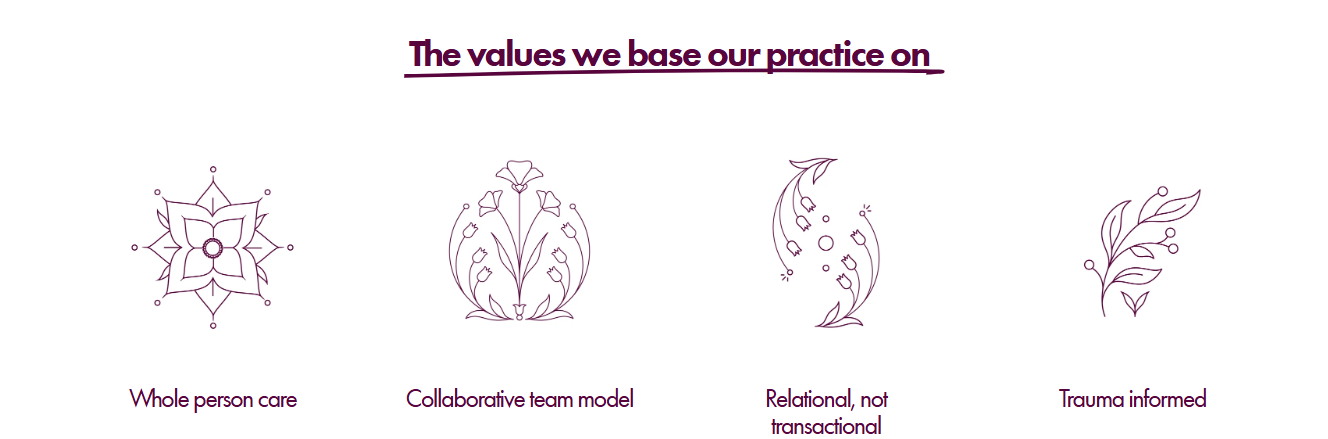
But why flowers? Well, flowers have a way of always changing and unfolding slowly. They grow, adapt, and evolve over time. People do too. It felt like a fitting language for concepts rooted in healing and growth.
From print graphics to digital educational resources, the messaging emphasizes actionable guidance, holistic wellness, and personal growth, helping the brand connect with a wide audience.