Sequence
Built piece by piece, or dot by dot—
a brand designed to feel precise, polished, and just a little bit magic.
Little adjustments, magical impacts
Sequence already had an idea of who they were and what they wanted to look like, but it wasn’t quite finished. The problem? legibility. The refreshed identity focused on subtle refinement rather than dramatic reinvention. the updated logo system introduced cleaner spacing, updated geometry, brighter colors and a more elevated sense of rhythm across the typography.

Because sometimes the best branding magic happens in the littlest details, but when it comes together you just can’t unsee it.
Dot by dot, the whole thing came together
One of the defining visual elements of the Sequence identity became the pointillism-inspired graphic system. Instead of relying on loud graphics or oversized gestures, the graphics were intentionally restrained and highly detailed. Tiny repeated elements worked together to create movement, structure, and came together like people all joining the right company.
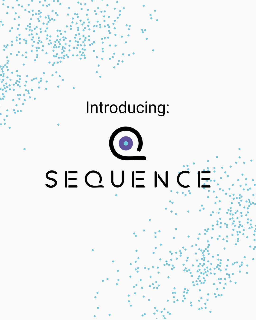
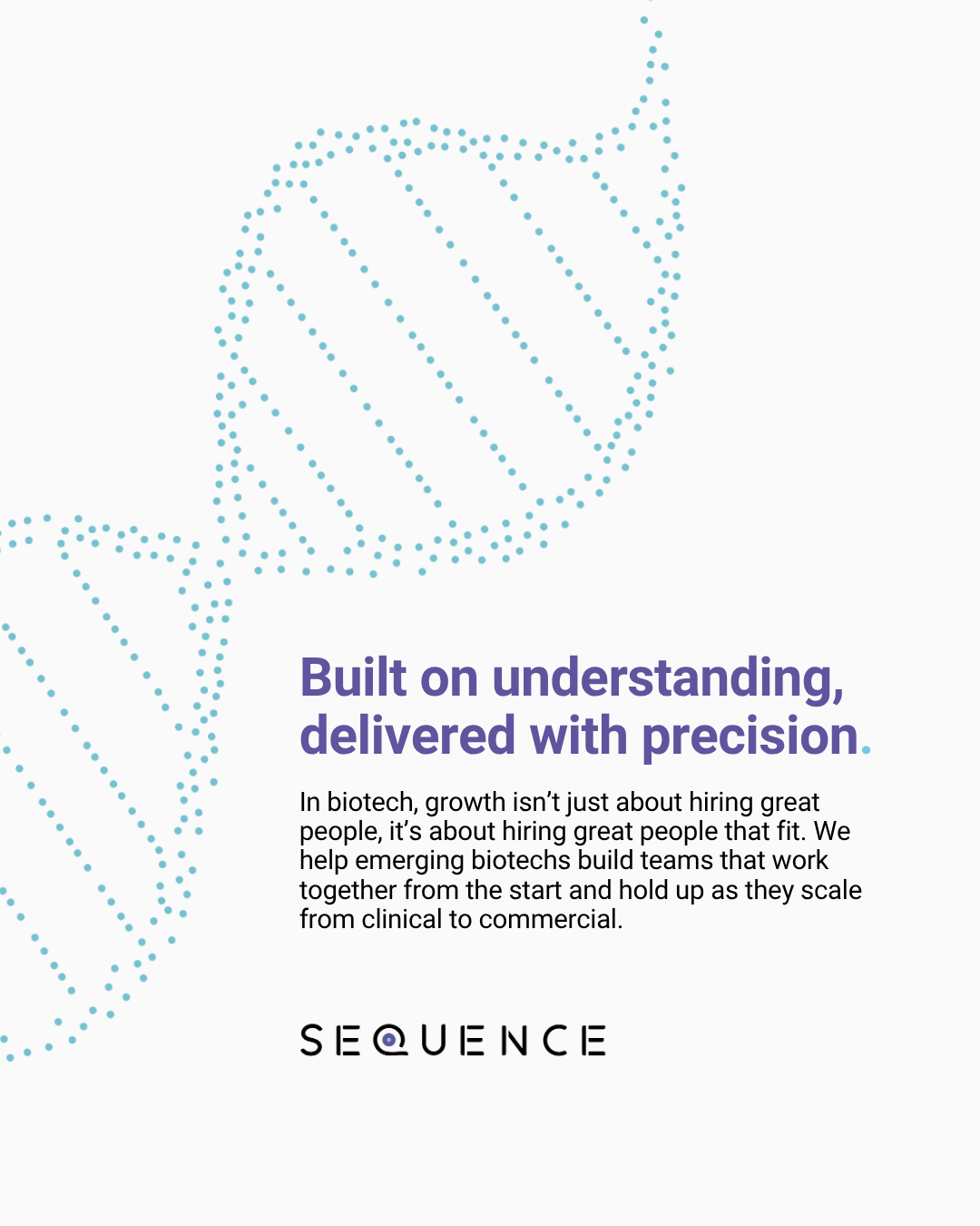

The icons expanded on this idea with a dual-color approach. Adding in the second color added just enough contrast to feel dimensional while still staying clean and professional. A little science. A little storytelling. A little “how did they make dots feel this sophisticated?”

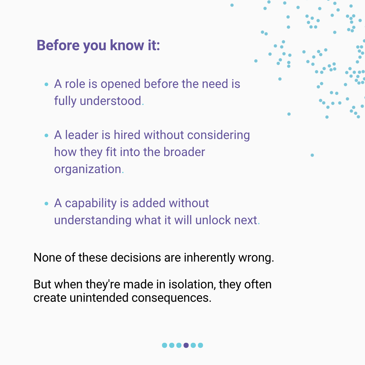
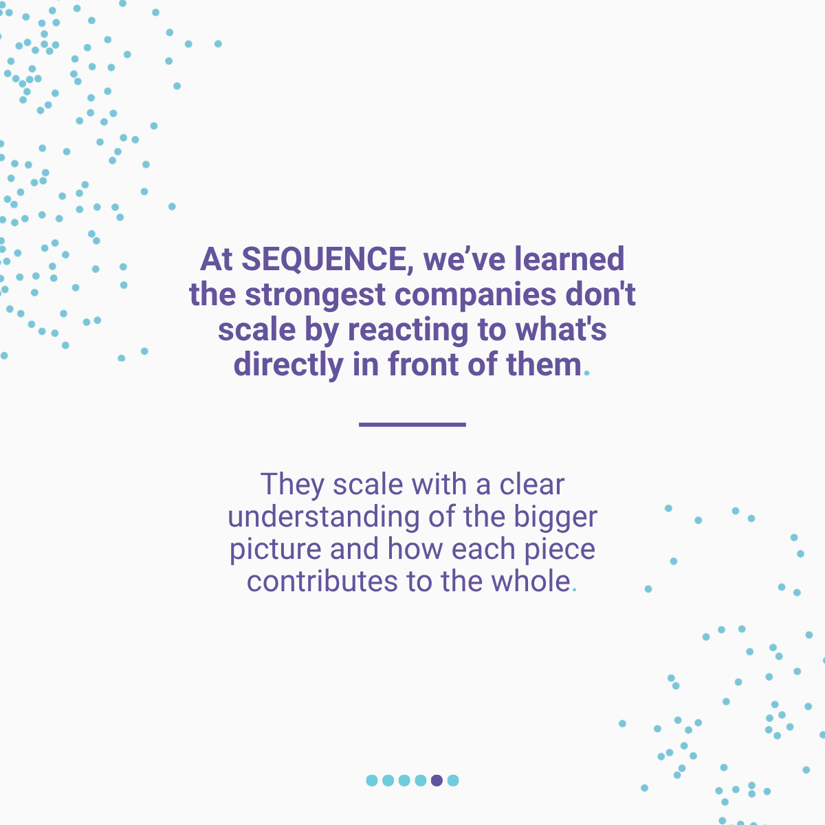
LinkedIn content… but make it actually engaging.
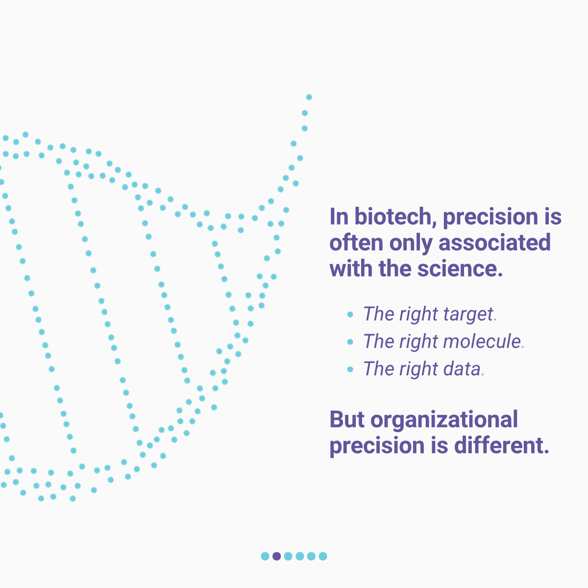
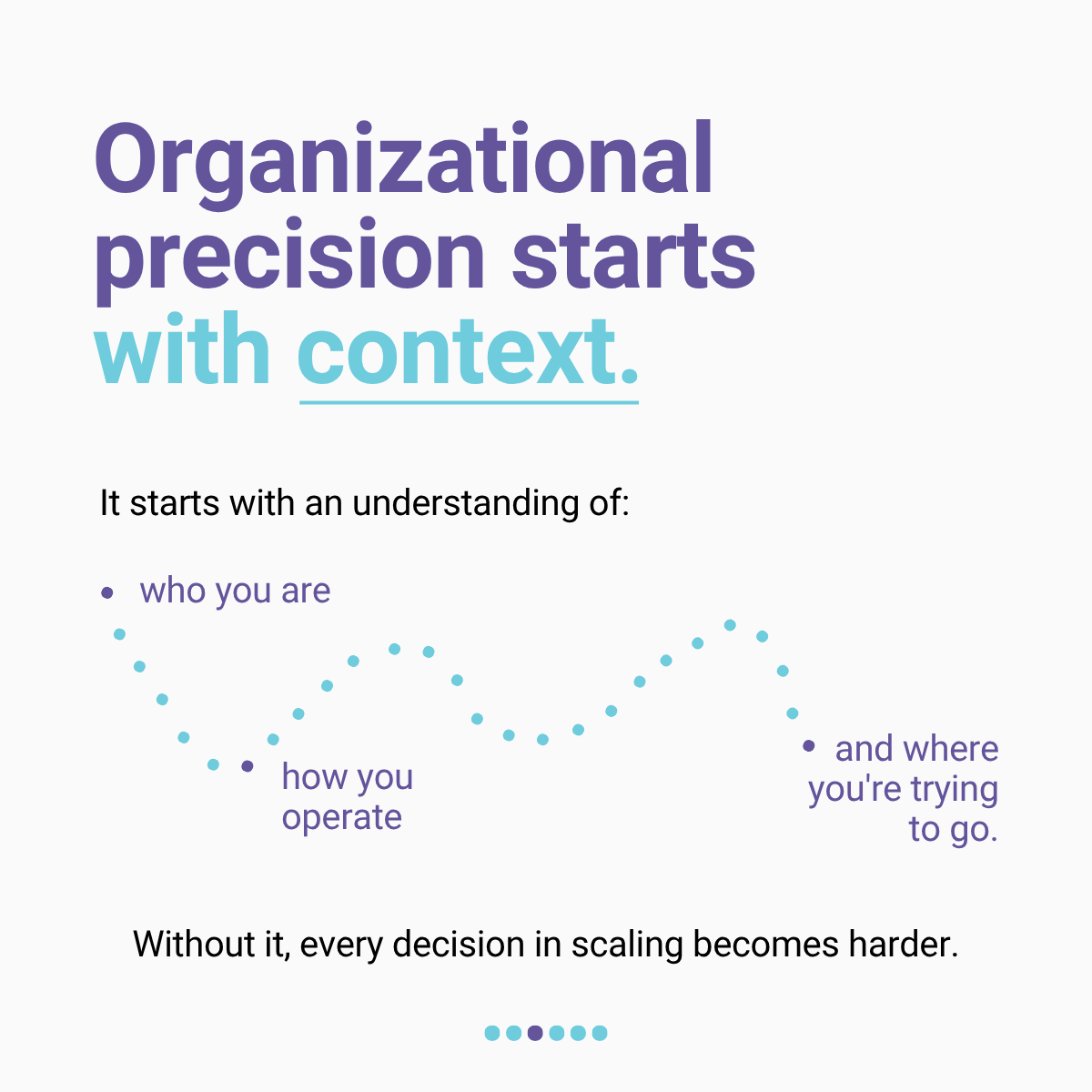
The social media posts for Sequence was designed around narrative flow—using typography, pacing, and subtle visual texture to guide viewers through each carousel post slide by slide. Rather than treating social graphics as isolated announcements, the posts were designed more like mini editorial stories: strong headlines, intentional hierarchy, and layouts that encouraged people to keep swiping.

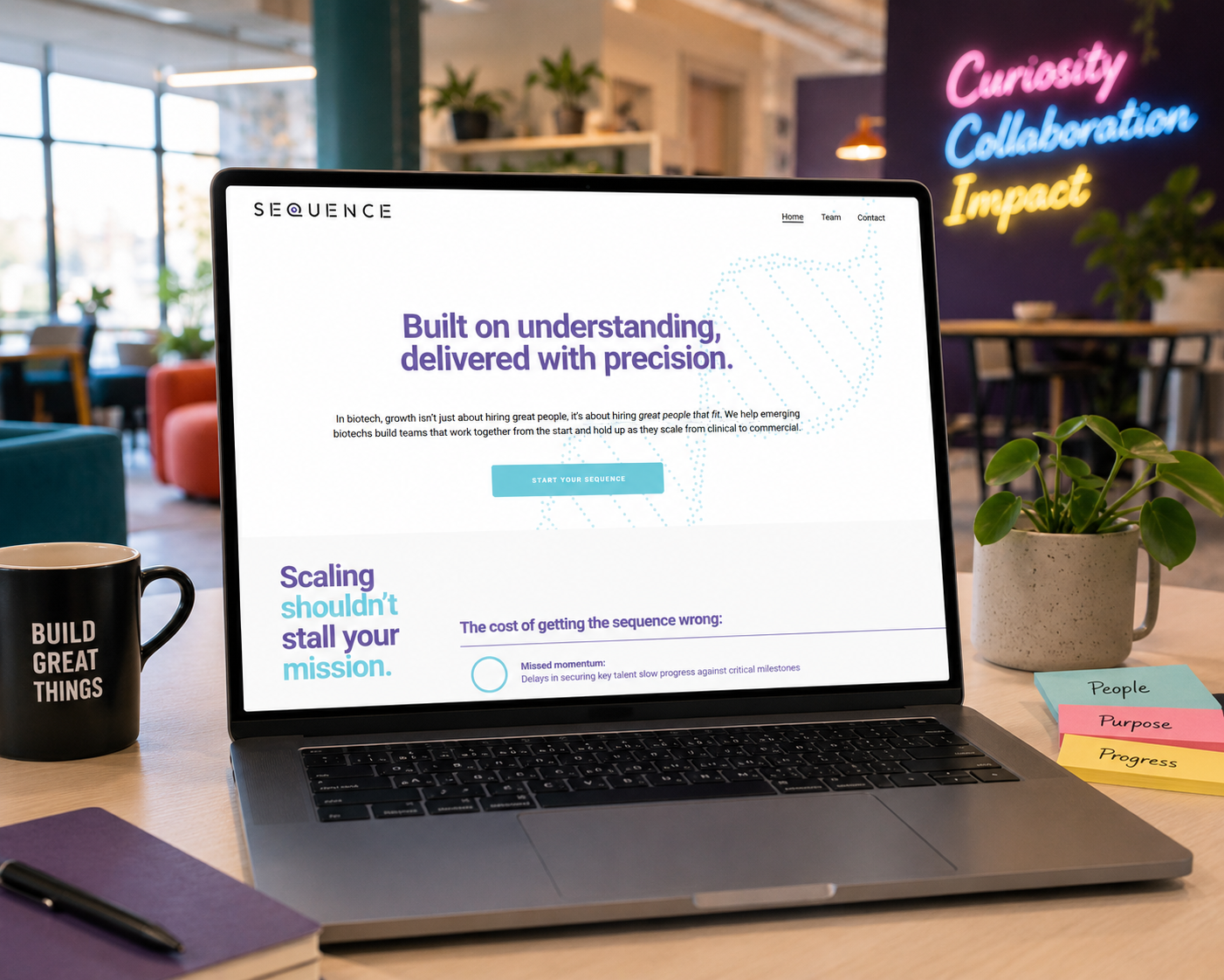
The website where it all clicked into place.
Clean typography, intentional whitespace, soft movement, and subtle graphic layering helped create a digital experience that felt clear and highly considered. Even the smallest design choices were built intentionally. The dotted graphic textures added depth without overpowering the content, while the restrained layouts helped maintain clarity across every page. All together creating a brand that felt elevated.
And somewhere between the typography, the pacing, and all those tiny little dots… the whole thing started to feel a bit magic.
By combining structure with softness, clarity with texture, and precision with personality, the final system created something that felt cohesive across every touchpoint—from social posts to presentations to the website itself.
Or, in other words: a brand built very carefully… one tiny dot at a time.